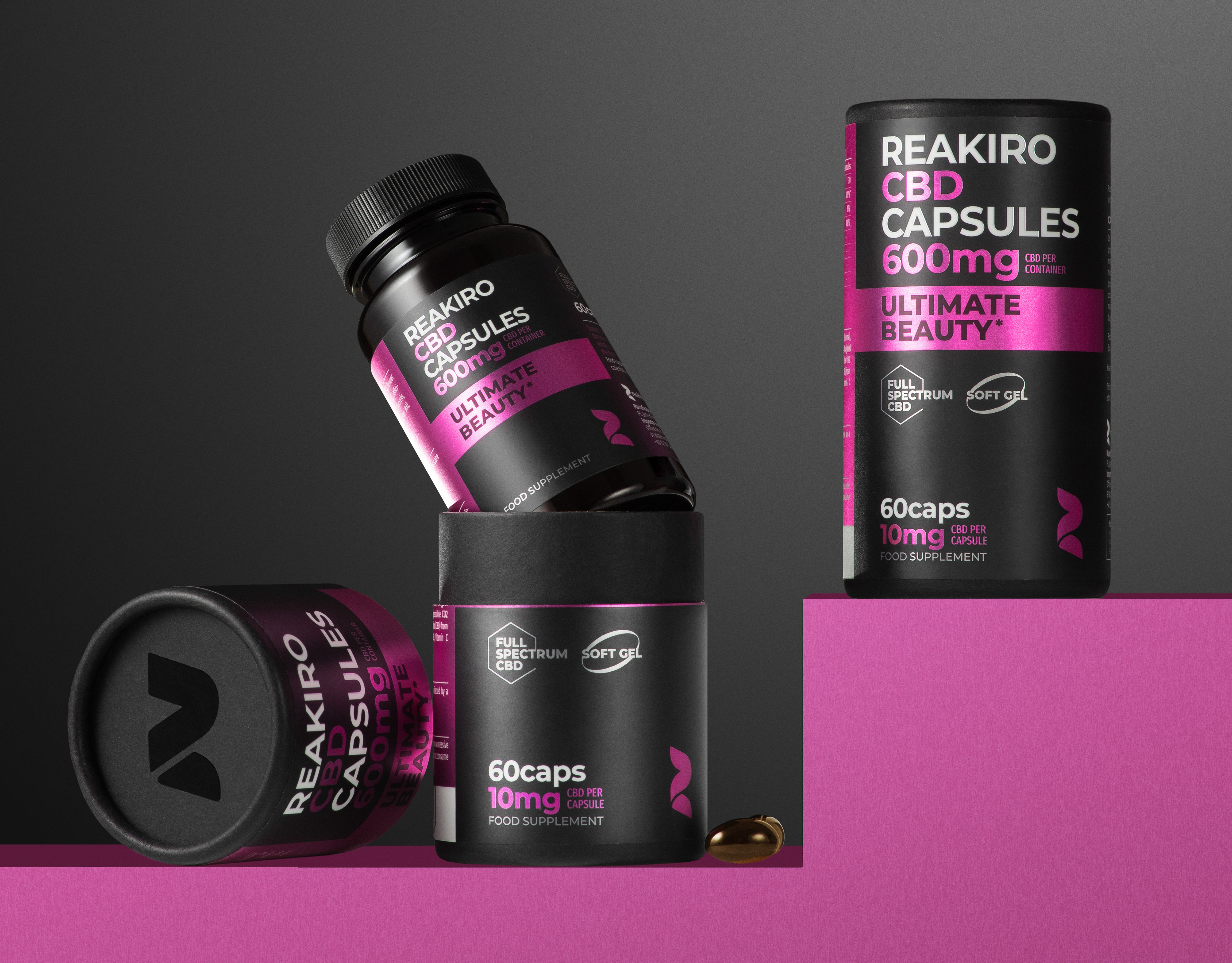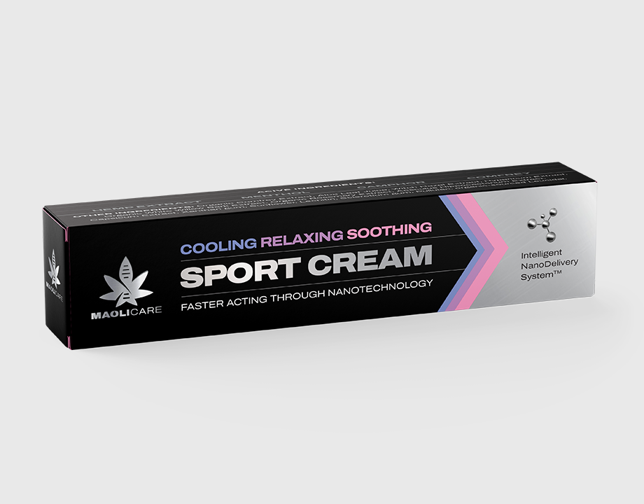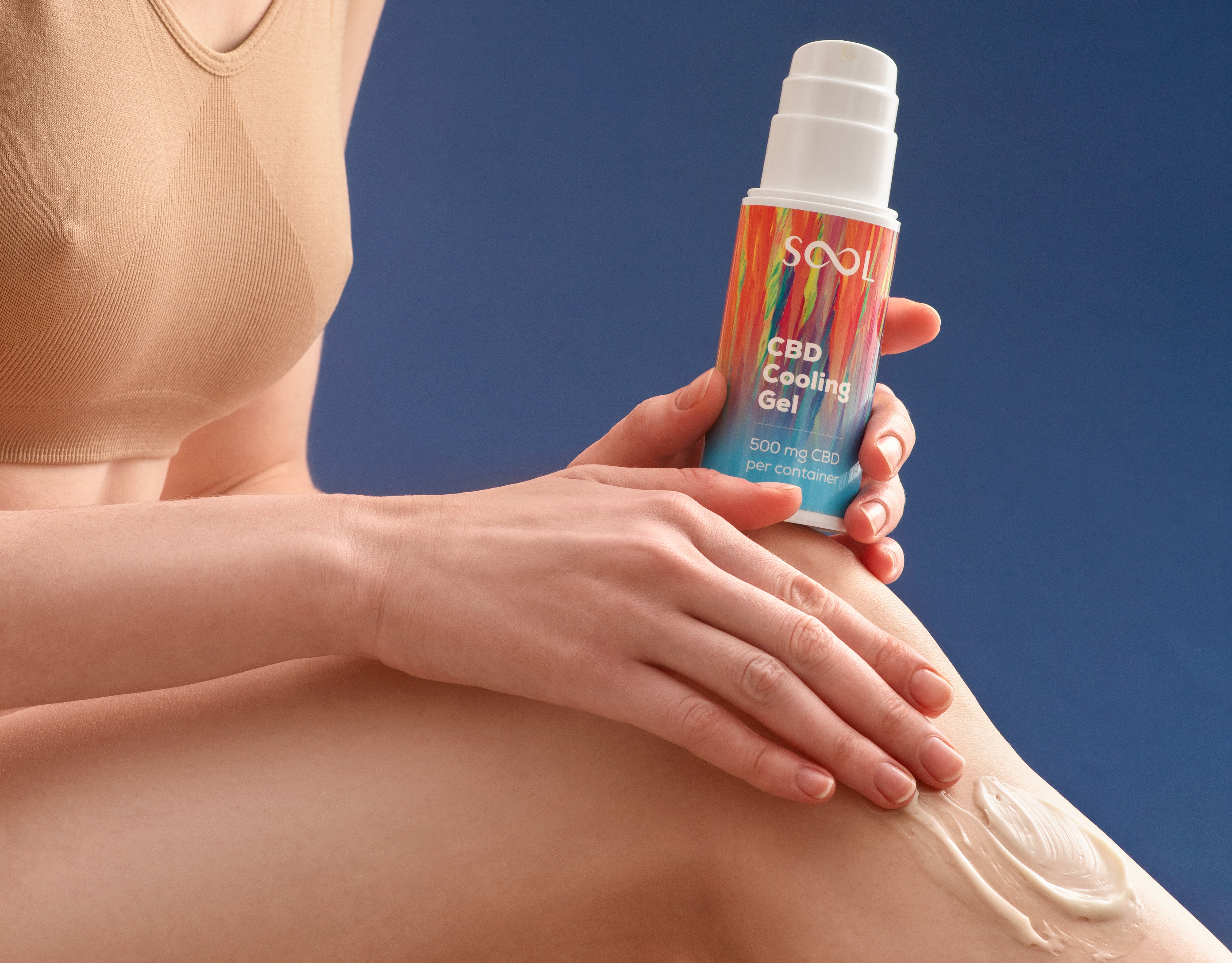
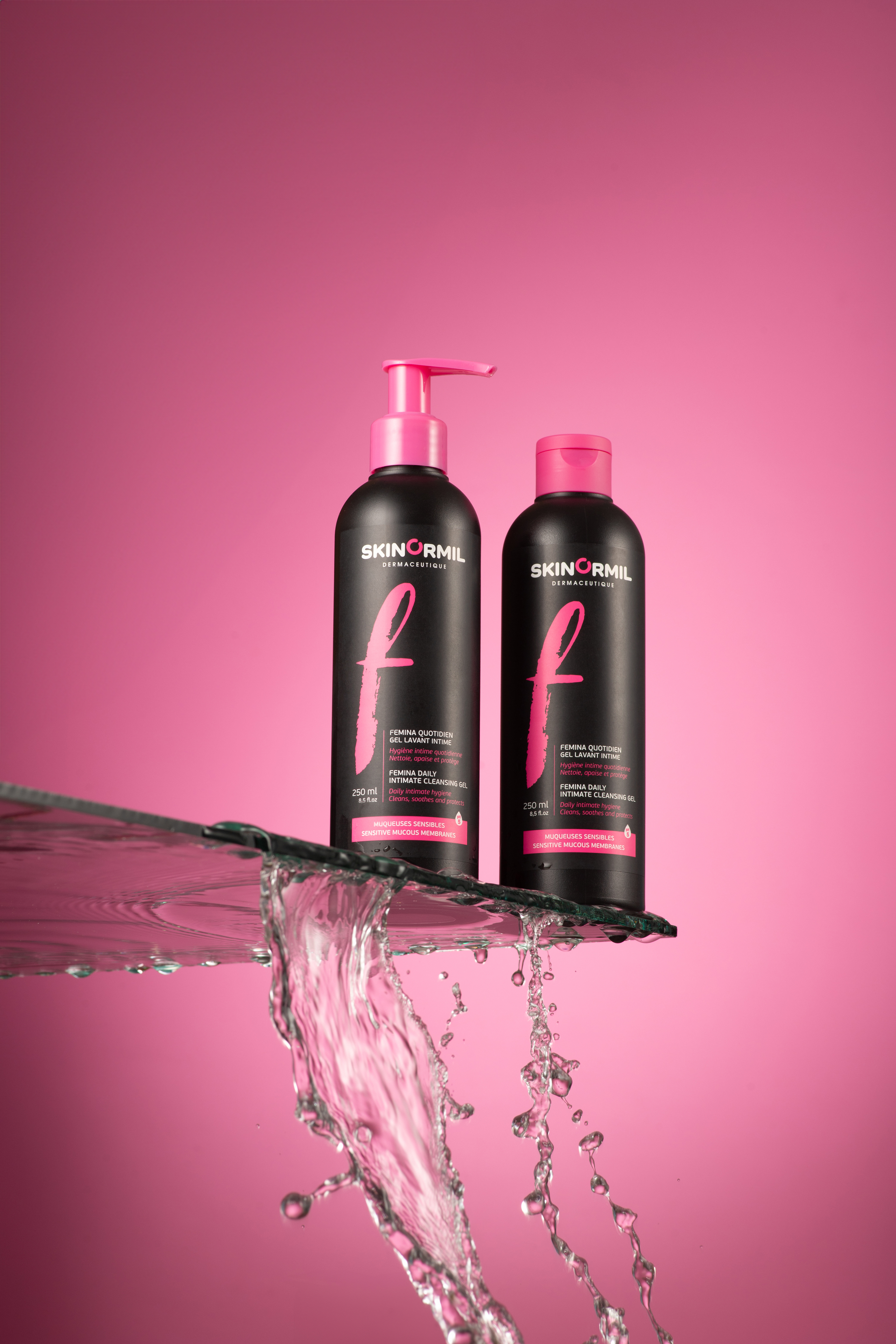
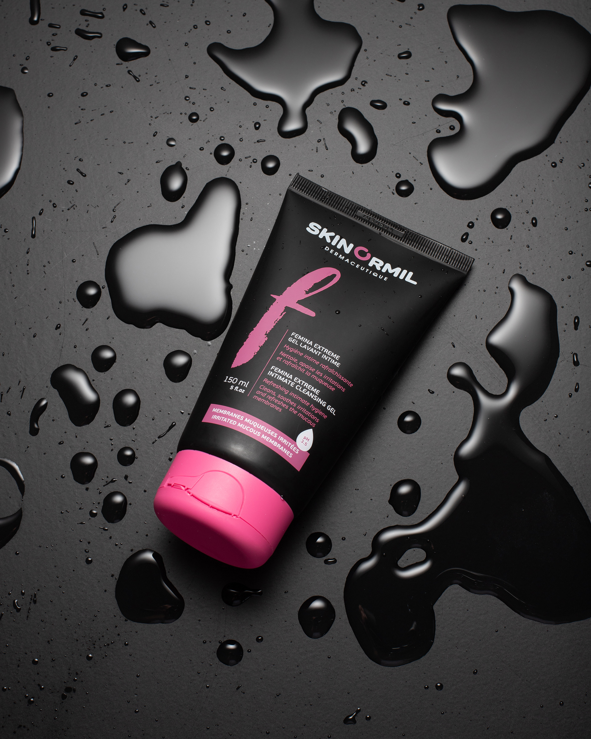
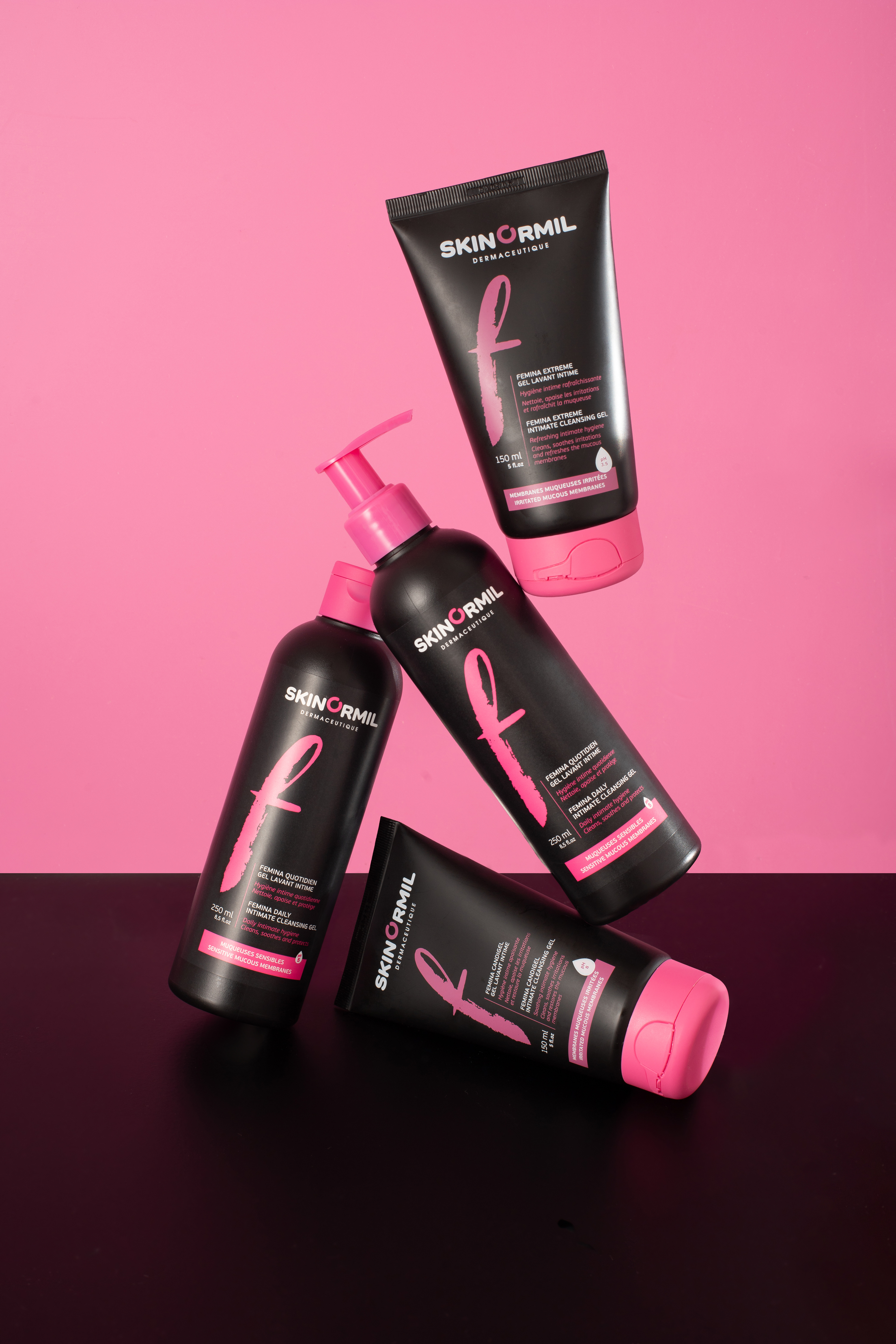
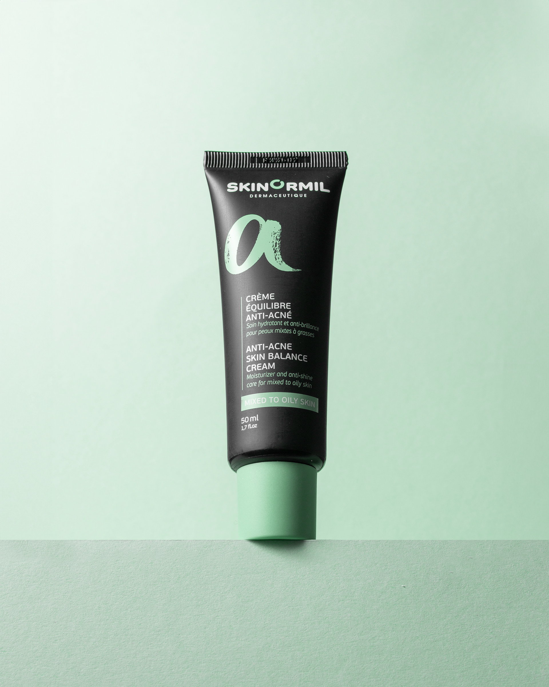
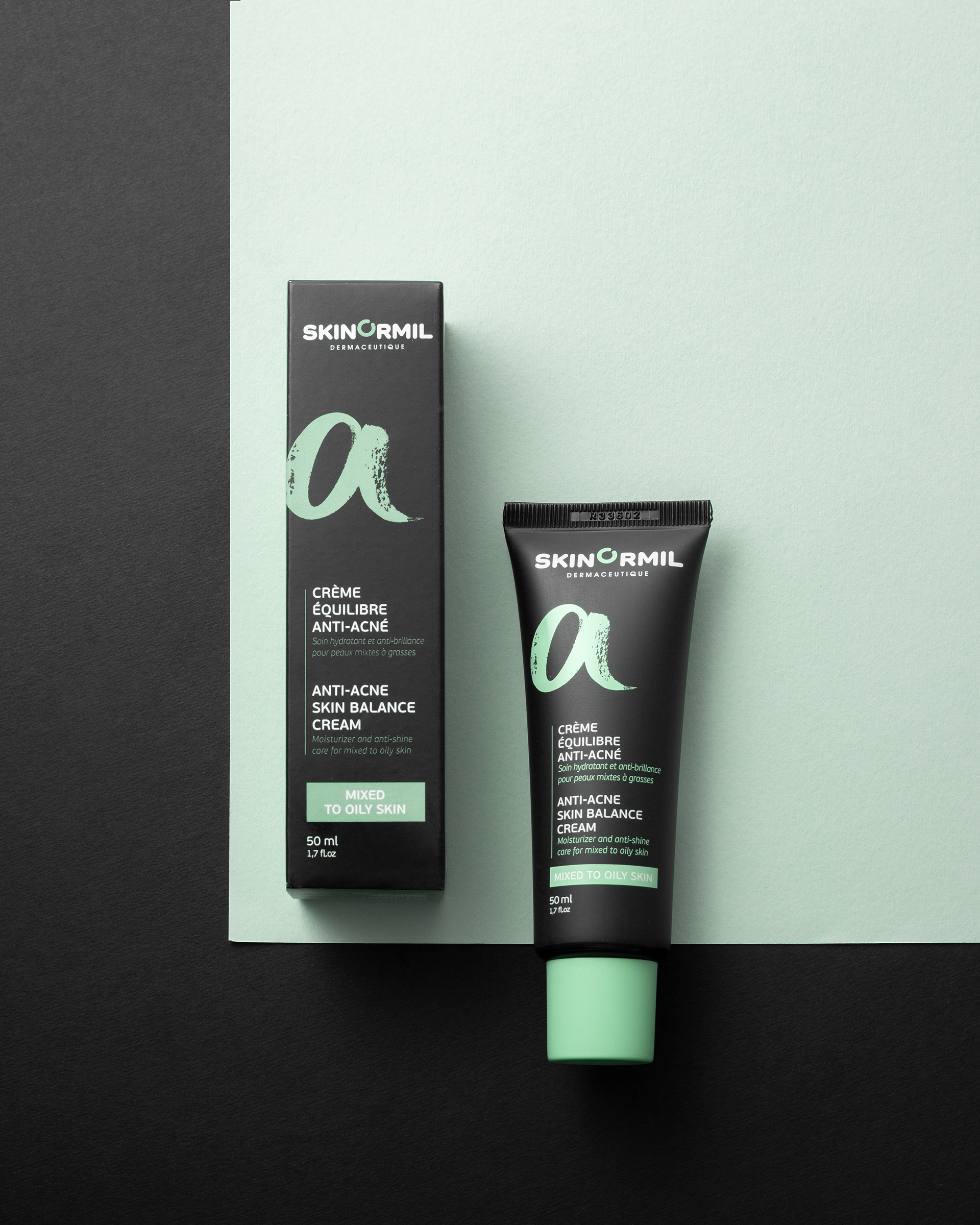
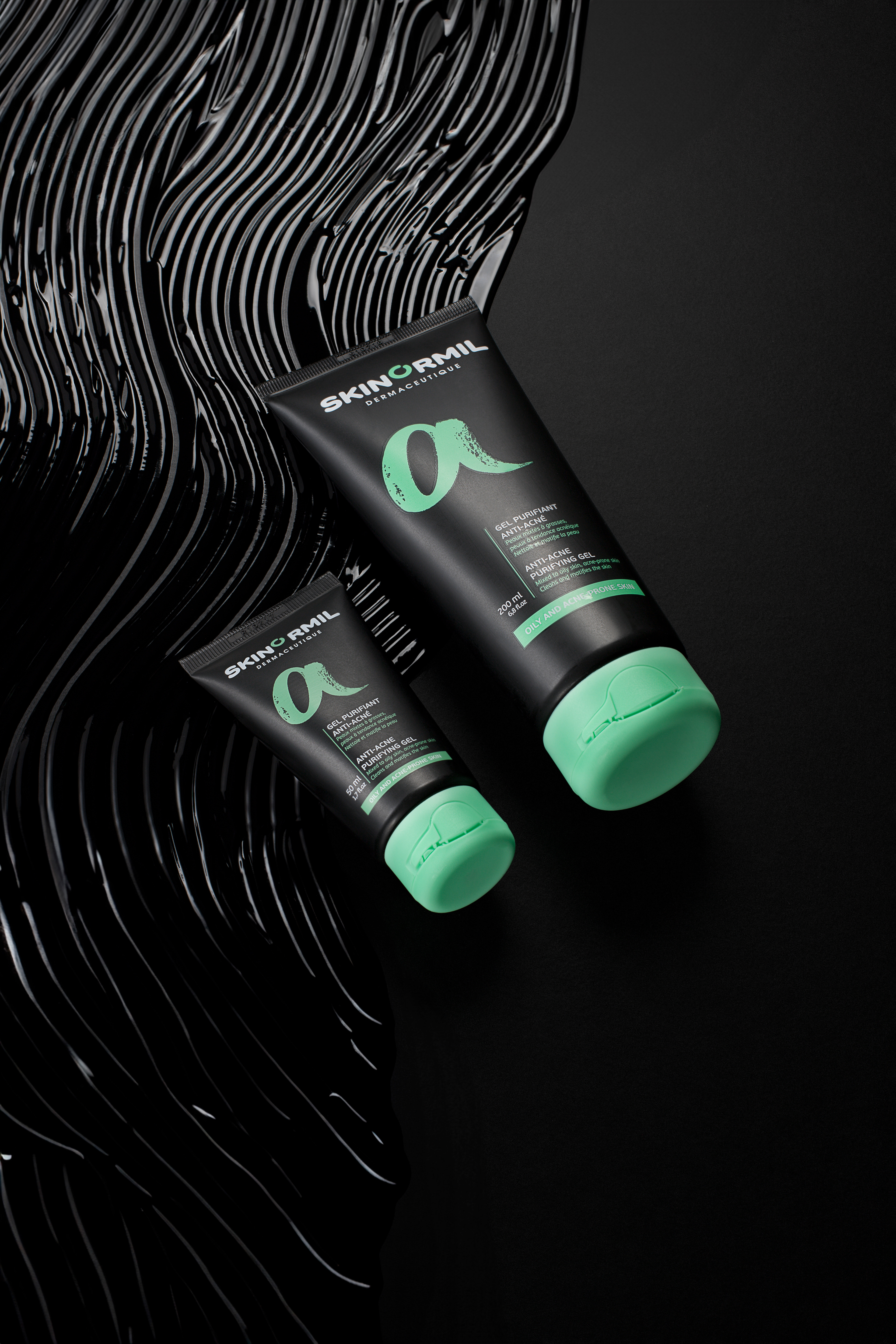
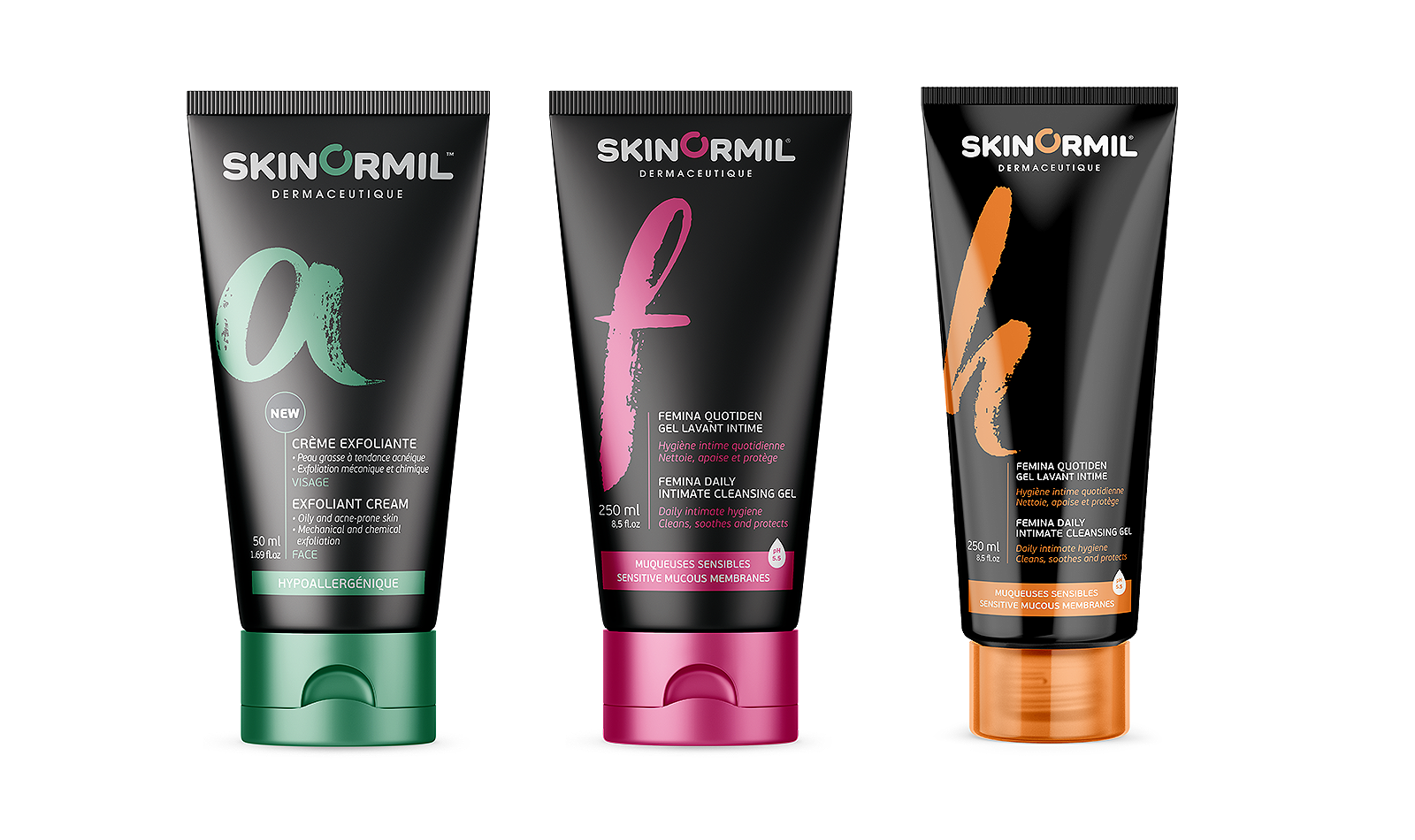
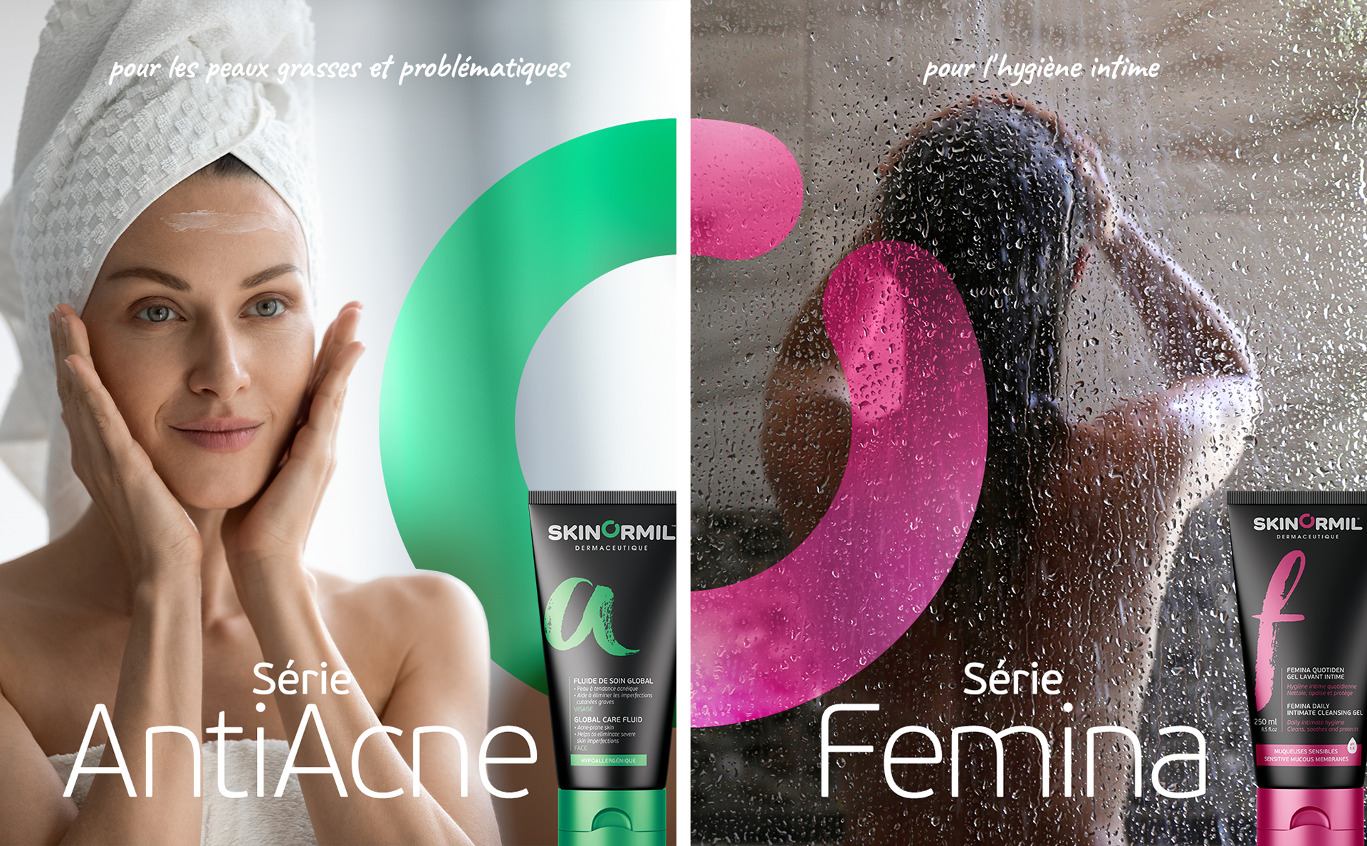
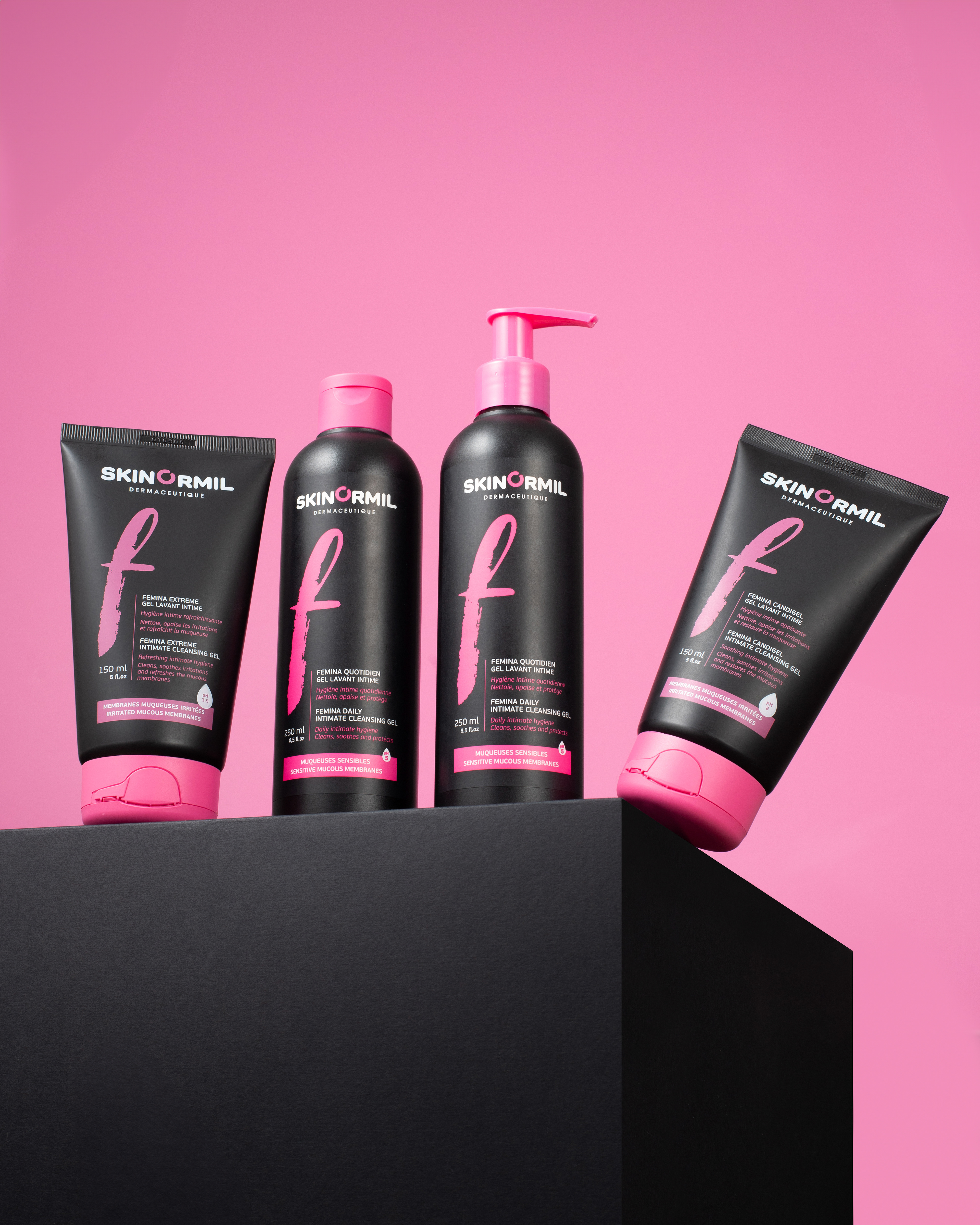
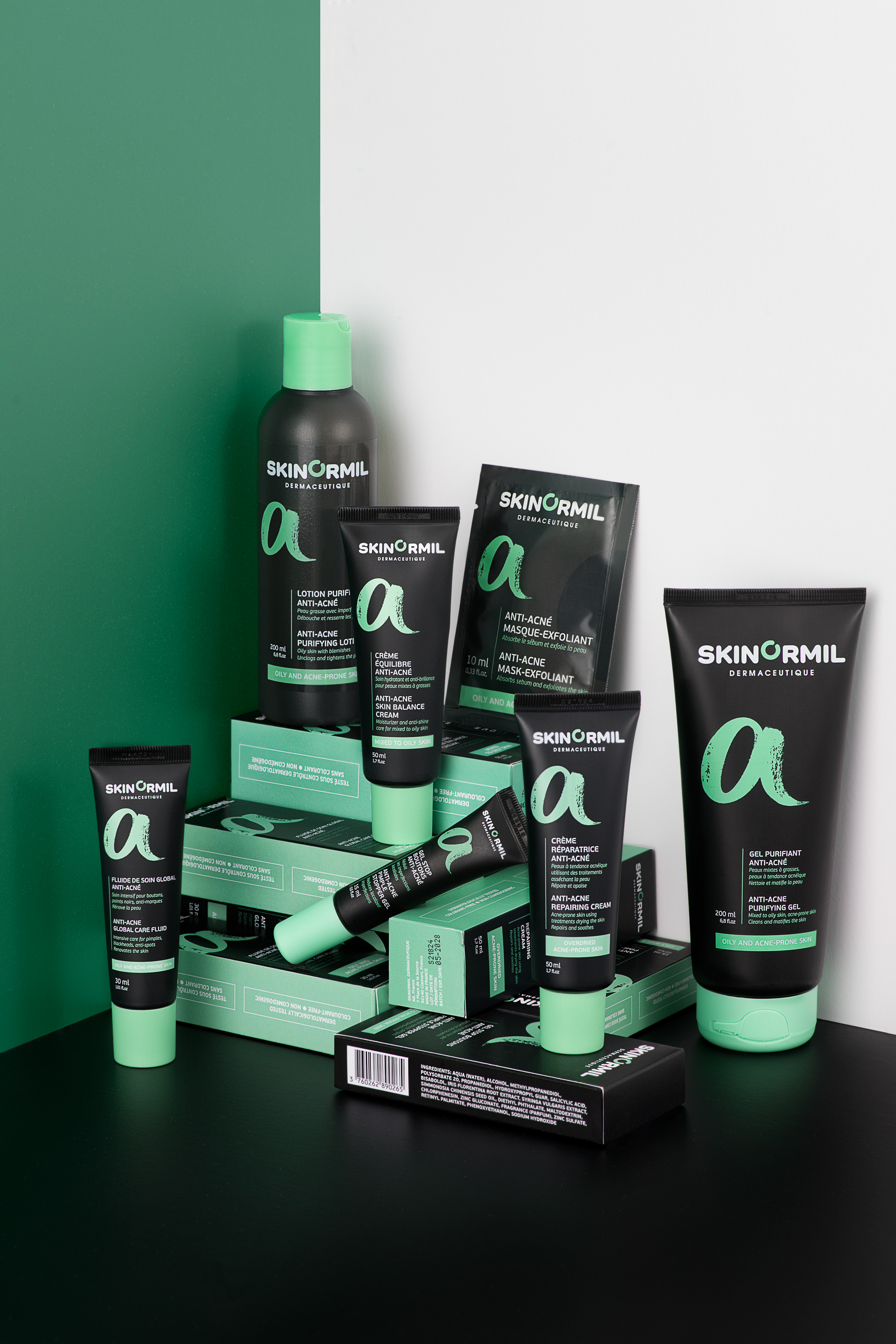
The design approach combined structured typography, clean packaging architecture, and a disciplined visual language to reinforce clarity and confidence at every touchpoint. A cohesive identity system was developed to support product differentiation across treatment categories while preserving brand consistency.
Packaging design focused on precision, legibility, and premium positioning while ensuring consistency across SKUs. The resulting brand system strengthens shelf presence, reinforces product credibility, and supports expansion into international wellness markets.
Ready to stand out in a crowded market?